

A curated collection of powerful and customizable UI component libraries for React and Next.js applications. These libraries provide pre-built components to accelerate your development process while maintaining high-quality, responsive designs.
Featured Libraries
Aceternity UI
Aceternity UI offers a collection of trendy and easy-to-use components and templates for building websites with Tailwind CSS and Framer Motion. Modern UI components with stunning animations and effects. Perfect for creating engaging, interactive user experiences.
- Highlights: Tailwind CSS based, beautiful animations
- Best for: Modern, animation-heavy applications
- Notable Components: Animated cards, floating navigation, particle effects
Link: https://ui.aceternity.com/
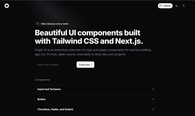
Origin UI
Beautiful UI components built with Tailwind CSS and Next.js. Designed for developers seeking a modern, responsive, and easily customizable component library.
- Highlights: Next.js native, seamless Tailwind integration
- Best for: Next.js projects requiring clean, modern UI
- Notable Components: Responsive grids, interactive form elements, dark mode components
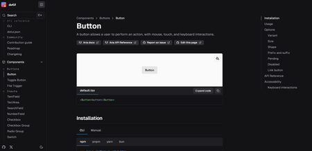
Shadcn/UI
Beautifully designed components built with Radix UI and Tailwind CSS. Not a traditional component library, but a collection of reusable components that can be copied and customized.
- Highlights: High customizability, accessible components
- Best for: Projects requiring full control over component implementation
- Notable Components: Calendar, command palette, sheets

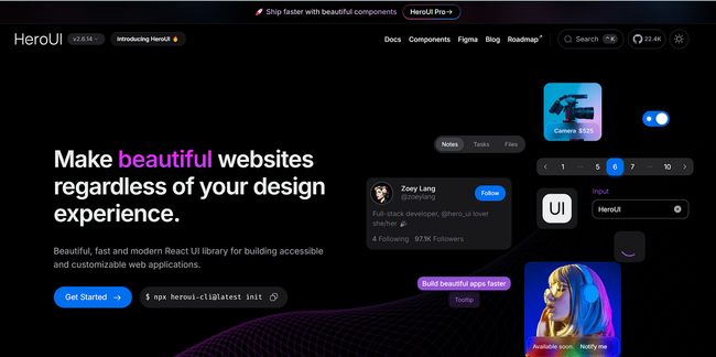
HeroUI (Previously NextUI)
Beautiful, fast, and modern React UI library built with Tailwind CSS and Framer Motion.
- Highlights: Modern design, dark mode support
- Best for: Next.js projects requiring modern UI components
- Notable Components: Data tables, modals, advanced form elements
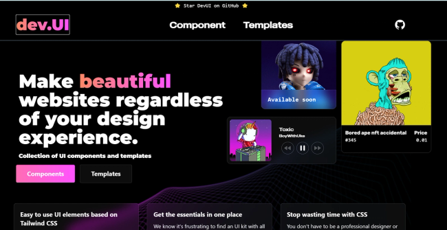
DevUI
Developer-focused component library with a clean, professional aesthetic.
- Highlights: TypeScript support, extensive documentation
- Best for: Enterprise applications and developer tools
- Notable Components: Code editors, terminal interfaces, dashboards
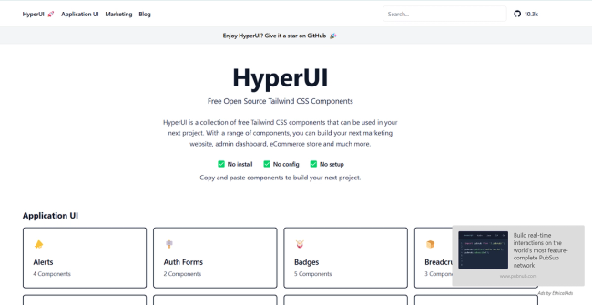
HyperUI
Collection of free Tailwind CSS components designed for rapid UI development.
- Highlights: Ready-to-use Tailwind components
- Best for: Quick prototyping and Tailwind CSS projects
- Notable Components: Marketing sections, ecommerce components
Link: https://www.hyperui.dev/
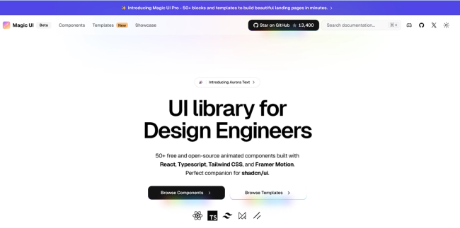
Magic UI
Beautifully crafted UI components with focus on animations and micro-interactions.
- Highlights: Unique animations, modern design patterns
- Best for: Applications requiring engaging user interactions
- Notable Components: Animated cards, loaders, transitions
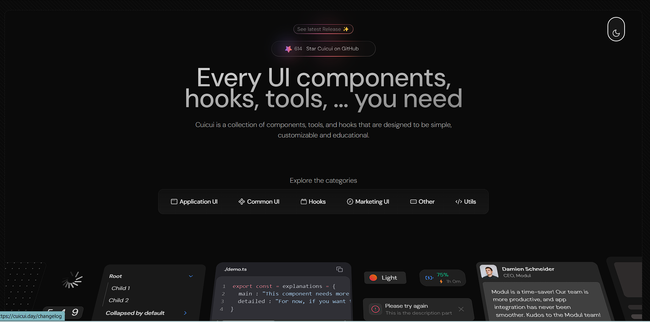
CuiCui
High-quality React and Tailwind CSS components library designed for easy copy-paste integration.
- Highlights: Instant copy-paste components, modern design
- Best for: Rapid development, prototyping
- Notable Components: Marketing sections, landing pages, interactive UI elements
Ant Design
Enterprise-grade UI design system with comprehensive components.
- Highlights: Enterprise-ready, extensive ecosystem
- Best for: Large-scale enterprise applications
- Notable Components: Advanced tables, form builders, date pickers
Link: https://ant.design/components/overview/
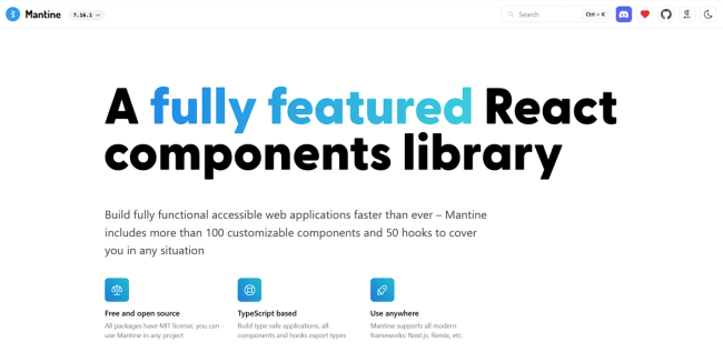
Mantine
Full-featured React components library with excellent TypeScript support.
- Highlights: Comprehensive documentation, modular architecture
- Best for: TypeScript projects requiring extensive component libraries
- Notable Components: Rich text editor, date picker, notifications
DotUI
Minimalist component library focused on simplicity and performance.
- Highlights: Lightweight, fast rendering
- Best for: Performance-critical applications
- Notable Components: Lightweight modals, tooltips, accordions
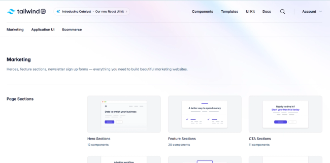
TailwindUI Or Tailwind Plus
Community-driven collection of Tailwind CSS components.
- Highlights: Ready-to-use Tailwind snippets
- Best for: Tailwind CSS projects needing quick solutions
- Notable Components: Navigation menus, cards, heroes
Link: https://tailwindcss.com/plus
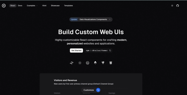
Tailus UI
Modern UI library built with Tailwind CSS focusing on design consistency.
- Highlights: Consistent design language
- Best for: Projects requiring cohesive design systems
- Notable Components: Marketing components, authentication forms
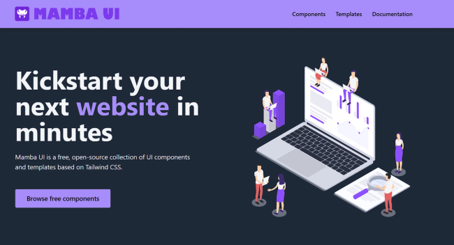
Mamba UI
Minimalist component library with clean, modern designs.
- Highlights: Clean aesthetics, minimal bundle size
- Best for: Projects prioritizing simplicity
- Notable Components: Simple yet elegant UI elements
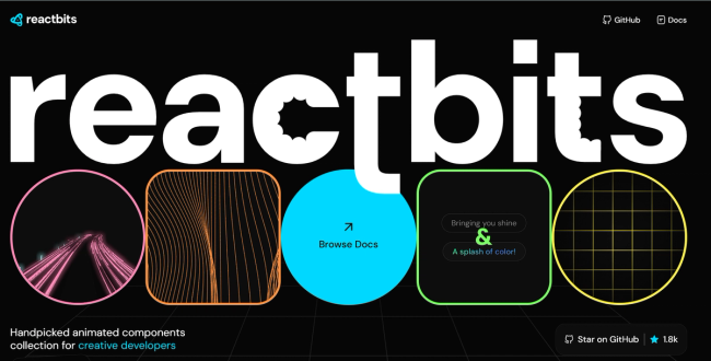
React Bits
Collection of interactive and animated React components.
- Highlights: Focus on interactive elements
- Best for: Projects needing engaging UI interactions
- Notable Components: Bounce cards, animated interfaces
Link: https://www.reactbits.dev/
Getting Started
-
Choose a library based on your project needs:
- Consider factors like bundle size, customization options, and documentation quality
- Check compatibility with your tech stack
- Review the component ecosystem
-
Installation typically follows one of these patterns:
# For npm npm install @library-name/react # For yarn yarn add @library-name/react -
Most libraries support tree-shaking for optimal bundle sizes
Best Practices
- Mix and Match: Don't hesitate to use components from different libraries when needed
- Customize: Most libraries support theming and styling customization
- Accessibility: Verify accessibility features of components before implementation
- Performance: Monitor bundle size impact when adding new components
Last updated: January 2025