
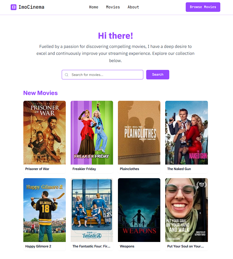
ImoCinema
A modern, minimal movie discovery website built with Next.js, featuring a clean UI design and comprehensive movie search functionality.


✨ Features
- Modern UI/UX: Clean, minimal design with consistent color scheme and typography
- Responsive Design: Mobile-first approach with responsive grid layouts
- Movie Search: Advanced search functionality with real-time results
- Movie Discovery: Browse trending and popular movies
- Sticky Navigation: Persistent header with smooth navigation
- Skeleton Loading: Elegant loading states with animated placeholders
- Compact Cards: Small, efficient movie cards for better browsing experience
- 4-Column Grid: Optimized layout for desktop and tablet viewing
🛠️ Tech Stack
- Framework: Next.js 14 (App Router)
- Language: TypeScript
- Styling: Tailwind CSS
- UI Components: Radix UI + Custom Components
- Icons: Lucide React
- State Management: React Hooks
- API: RESTful API with Next.js API Routes
🚀 Getting Started
Prerequisites
- Node.js 18+
- pnpm (recommended) or npm
Installation
- Clone the repository
git clone https://github.com/Manish-Tamang/ImoCinema.git
cd ImoCinema
- Install dependencies
pnpm install
# or
npm install
- Run the development server
pnpm dev
# or
npm run dev
- Open http://localhost:3000 in your browser
📁 Project Structure
ImoCinema/
├── app/
│   ├── api/
│   ├── movie/
│   ├── search/
│   └── layout.tsx
├── components/
│   ├── ui/
│   ├── header.tsx
│   ├── movie-card.tsx
│   └── footer.tsx
├── lib/
├── public/
└── styles/
🎨 Design Principles
- Minimalism: Clean, uncluttered interface
- Consistency: Unified color palette and typography
- Accessibility: High contrast and readable fonts
- Performance: Optimized loading with skeleton states
- Responsiveness: Adaptive layouts for all devices
📱 Responsive Breakpoints
- Mobile: 2 columns (grid-cols-2)
- Tablet: 3 columns (sm:grid-cols-3)
- Desktop: 4 columns (md:grid-cols-4)
🎯 Key Components
Header
- Sticky navigation with minimal design
- Responsive mobile menu
- Consistent branding and navigation
Movie Cards
- Compact, efficient design
- Hover effects and transitions
- Optimized image loading
Search Interface
- Clean search form with minimal styling
- Real-time search results
- Skeleton loading states
🙏 Acknowledgments
- Milan Bhandari (@milancodess) for the movie scraping logic from Soap2Day